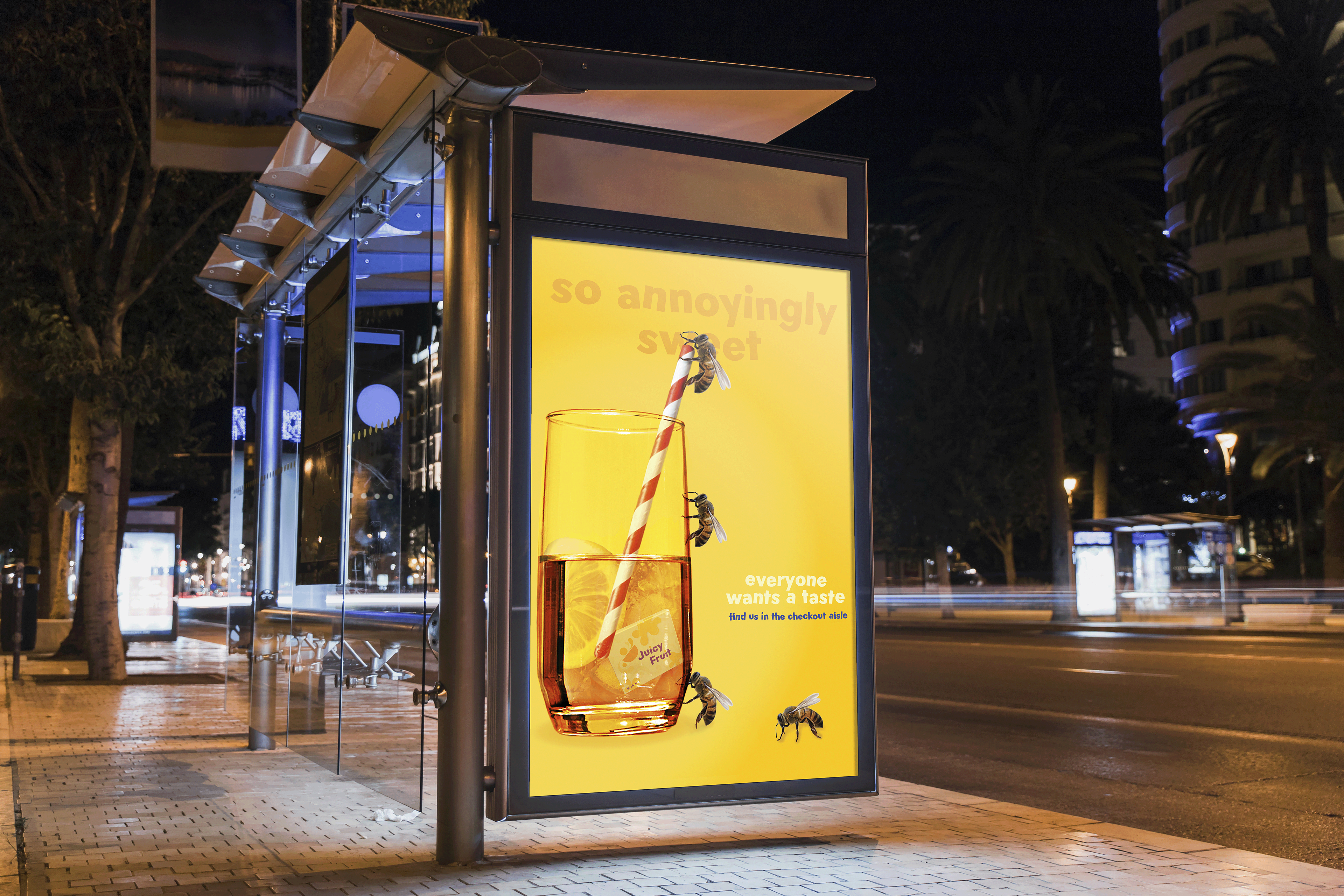
Growing up doesn’t mean you have to give up all the sweetness of childhood. With its biggest audience being reported as mainly 4-11-year-olds, Juicy Fruit was lacking when it came to gum lovers outside of childhood. Thus, the rebrand! The goal of this rebrand was to maintain the same fun, funky, and bubbly (no pun intended) nature of Juicy Fruit gum while making the overall branding feel a bit more mature and refined.
branding

Fonts

Logo

Patterns
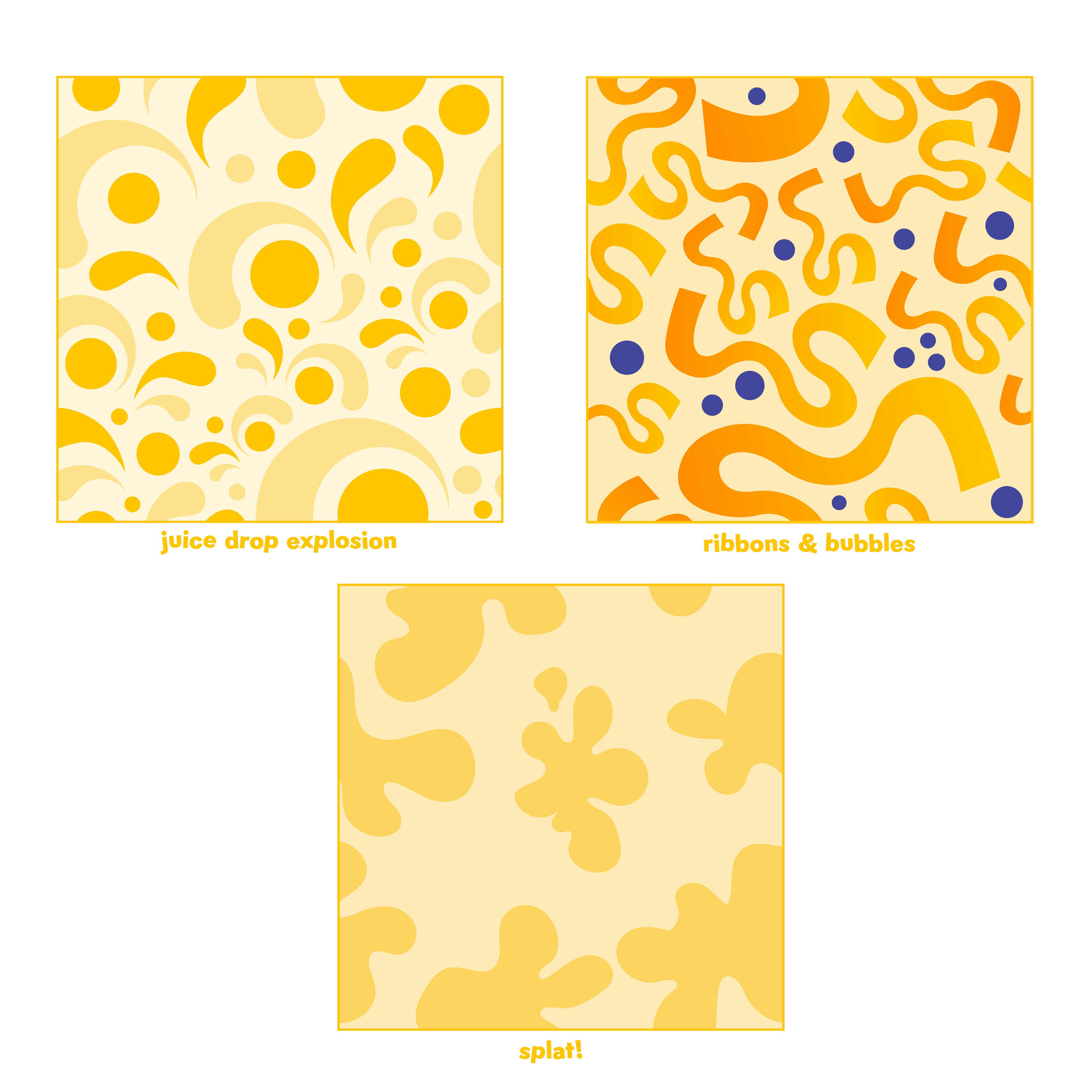
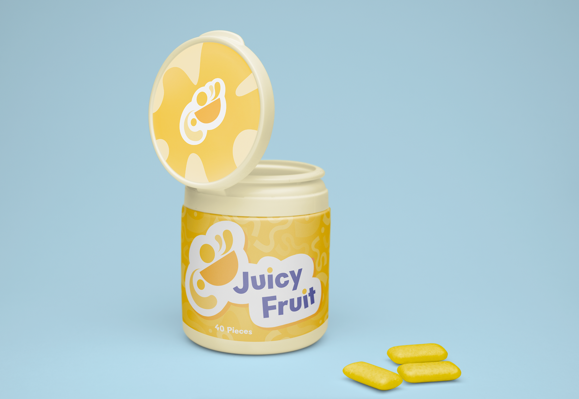
By keeping the color palette similar to the original the gum is able to maintain its recognizability but is now all grown-up. You see that enticing yellow piece of gum and you know it's Juicy Fruit. The logo redesign is what helps to set the stage for the new visual language of the brand. The abstract image represents the ambiguous flavor of the gum, leaving the shapes and colors up to interpretation by the taster. Is that an orange slice? Does that yellow look like a banana? You taste and tell me. The slight tilting of the letters in the primary typeface once again brings us back to the fun and quirky nature that ultimately grounds the brand. It's bubble gum, how serious can it truly be?
ad & packaging


